


Improved Navigation
A Cleaner, More Consistent Look
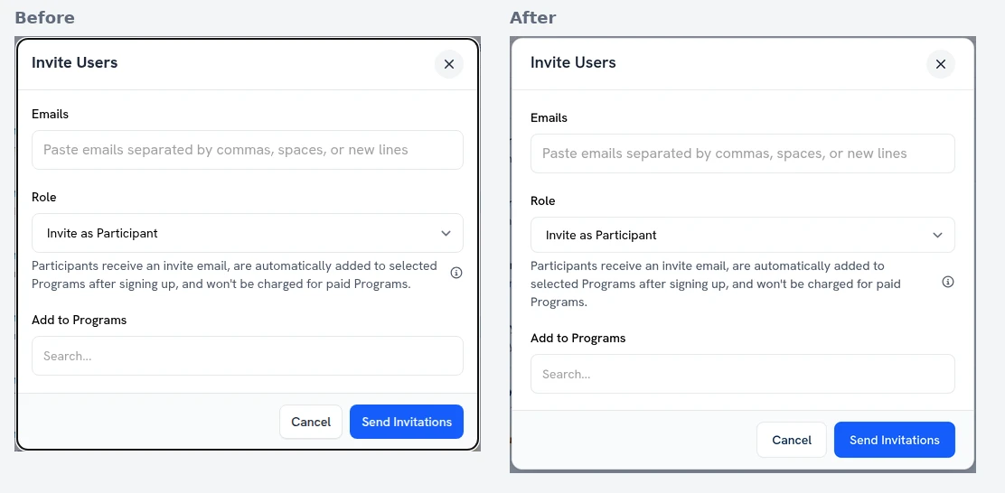
upcoach’s screens now share one look. Buttons, selects and search boxes have the same height and rounded corners. Badges and counters are one small pill. Cards and modals use the same flat surface with a light border. Tables share one header style, and tabs share one style.
On phones, tables stack into readable rows instead of scrolling sideways, and tab rows scroll so every tab stays in reach. Lists like Users and Offers are easy to read on a small screen.
 Read more